WAI-ARIA
An introduction to Accessible Rich Internet Applications
Prem Nawaz Khan

An introduction to Accessible Rich Internet Applications
An introduction to Accessible Rich Internet Applications
Prem Nawaz Khan

what is ARIA
and why do we need it?
it's "easy" (in most cases) to make static web content accessible, but nowadays the web strives to be an application platform
complex web applications require structures (e.g. interactive controls) that go beyond what regular HTML offers (though some of this introduced with HTML5 ... more on that later)
The WebAIM Million - The 2022 report on the accessibility of the top 1,000,000 home pages
code examples here are simplified
(but will hopefully convey the right concepts)


<div onclick="...">Test</div>for a sighted mouse / touchscreen user this is a button...
but what about keyboard users?

<div tabindex="0" onclick="...">Test</div>now we can at least focus it...but can we activate it?

<div tabindex="0" onkeyup="..." onclick="...">Test</div>faked button with focus and keyboard handling
for a sighted mouse / touchscreen / keyboard user this is a button...
but what about assistive technology users?
"test"
versus
"test button – to activate press SPACE bar"
generic/inappropriate HTML elements, with extra JavaScript/CSS on top...but they're still recognised and exposed as <span>, <div>, etc
the interplay of browser and assistive technology

Operating systems provide interfaces that expose information about objects and events to assistive technologies
(e.g. Microsoft Active Accessibility [MSAA], the Mac OS X Accessibility Protocol [AXAPI], IAccessible2 [IA2])
separate from the DOM, browsers build a matching "accessibility tree":
test using assistive technologies (e.g. screenreaders), however...
assistive technologies often use heuristics to repair incomplete/broken accessibility API information - so we want to check what's actually exposed to the OS/platform.
of course, browsers also have bugs/incomplete support...
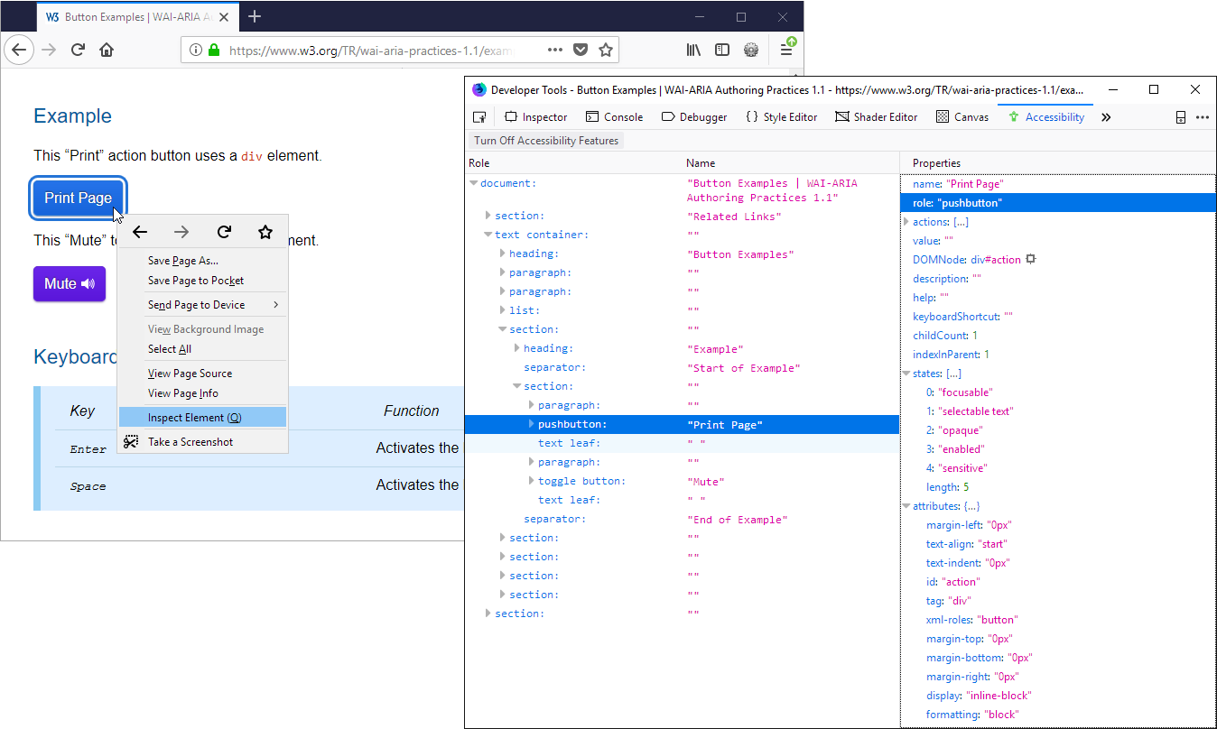
Firefox Accessibility Inspector (version 61+)
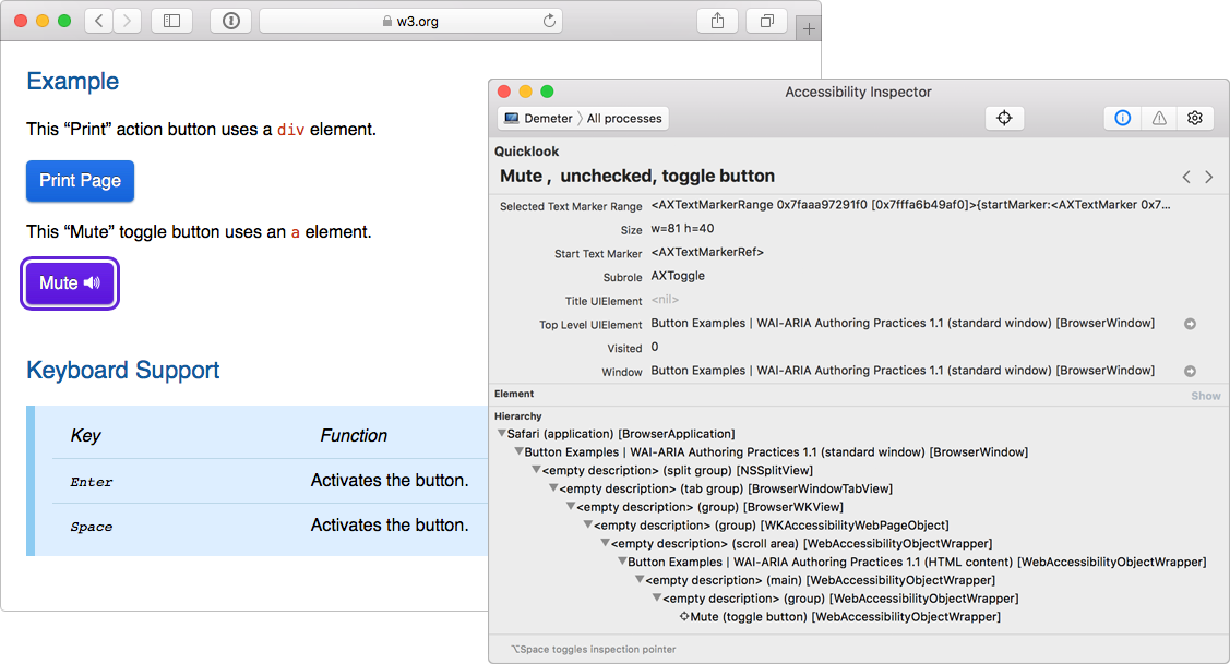
Xcode Accessibility Inspector
(but for Chrome, remember to turn on accessibility mode in chrome://accessibility)
if you use custom (not standard HTML) widgets,
use ARIA to ensure correct info is exposed
ARIA defines HTML attributes to convey correct role, state, properties and value
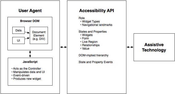
relationship between user agents (e.g., browsers), accessibility APIs, and assistive technologies
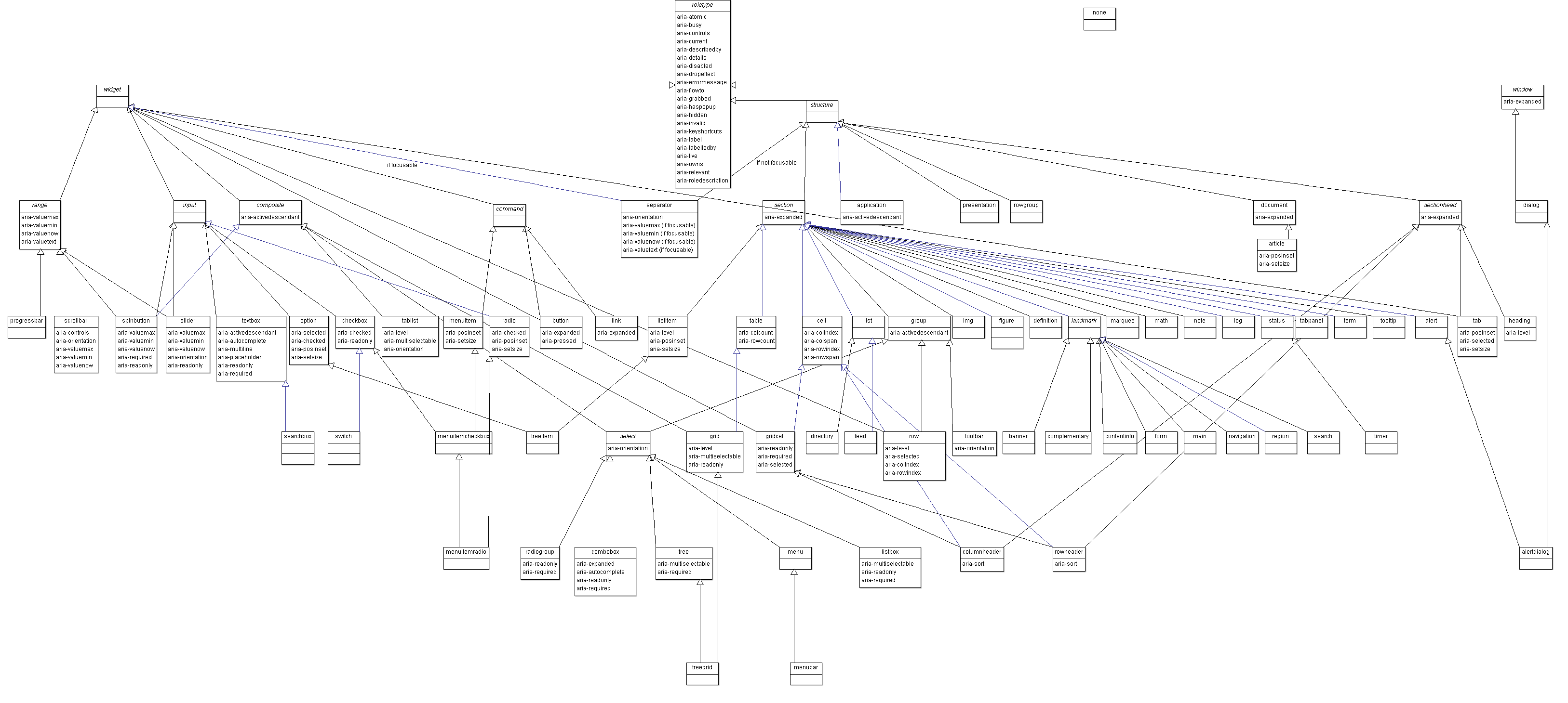
W3C - WAI-ARIA 1.1 - 5.3 Categorization of Roles
the whole model is vast and complex...and thankfully you don't need to remember this
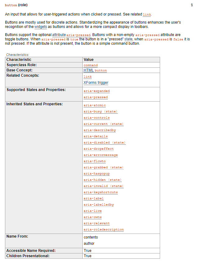
each role has "states and properties" (e.g. ARIA 1.1 definition for button)
implicit/inherited or defined via aria-* attributes
Basically What is this thing and What does it do?
this information is mapped by the browser to the operating system's accessibility API and exposed to assistive technologies.
extra benefit: once AT understands meaning/purpose, it can automatically announce specific hints and prompts
(e.g. JAWS "... button - to activate, press SPACE bar")

<div tabindex="0"
role="button" onkeyup="..."
onclick="...">Test</div>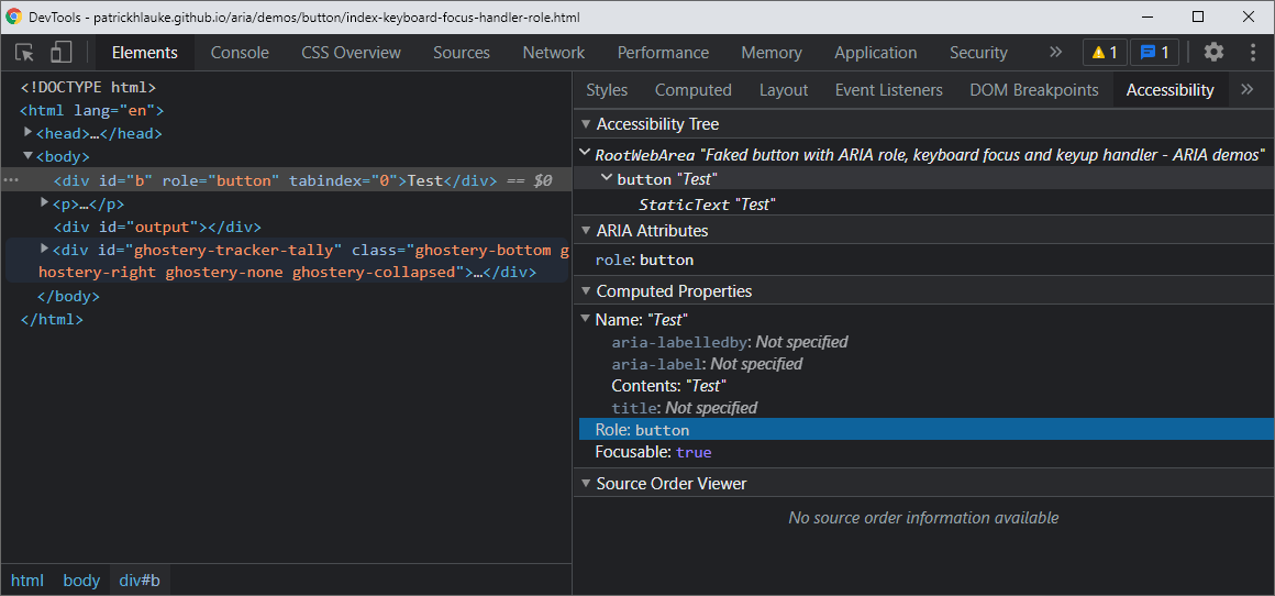
roles only make sense as part of a specific complex widgetaria-* attributes are globalaria-* attributes only make sense for particular roleARIA is not magic: it only changes how assistive technology interprets content. specifically, ARIA does not:
all of this is still your responsibility...
WAI-ARIA spec can be dry/technical - use for reference
ARIA Authoring Practices Guide (APG) more digestible.
in principle ARIA can be used in all markup languages
(depending on browser support)
ARIA in HTML
If you can use a native HTML element [HTML5] or attribute with the semantics and behaviour you require already built in, instead of re-purposing an element and adding an ARIA role, state or property to make it accessible, then do so.
you can use a <span> to behave as, and be exposed just like, a link...
<span tabindex="0" role="link"
      onclick="document.location='...'"
      onkeyup="...">link</span>
example: link
...but why would you?
unless there's a very good reason, just use <a href="...">...</a>
unless you really have to / know what you're doing
don't do this:
<h1 role="button">heading button</h1>otherwise the heading is no longer a heading
(e.g. AT users can't navigate to it quickly)
you can do this instead:
<h1><span role="button">heading button</span></h1>or, in accordance with the first rule or ARIA:
<h1><button>heading button</button></h1>example: heading button
don't do this:
<ul role="navigation">
    <li><a href="...">...</a></li>
    ...
</ul>
do this instead:
<div role="navigation">
    <ul>
        <li><a href="...">...</a></li>
        ...
    </ul>
</div>
or list is no longer a list (e.g. AT won't say "list with X items...")
example: list navigation
All interactive widgets must be focusable and scripted to respond to standard key strokes or key stroke combinations where applicable. [...]
Refer to design patterns and widgets sections of the ARIA Authoring Practices Guide
don't use role="presentation" or aria-hidden="true" on a visible focusable element. Otherwise, users will navigate/focus onto "nothing".
<!-- don't do this... -->

<button role="presentation">press me</button>

<button aria-hidden="true">press me</button>

<span tabindex="0" aria-hidden="true">...</span>
example: neutralised elements

Chrome DevTools indicates when a node is hidden
(directly, or due to an ancestor being hidden)
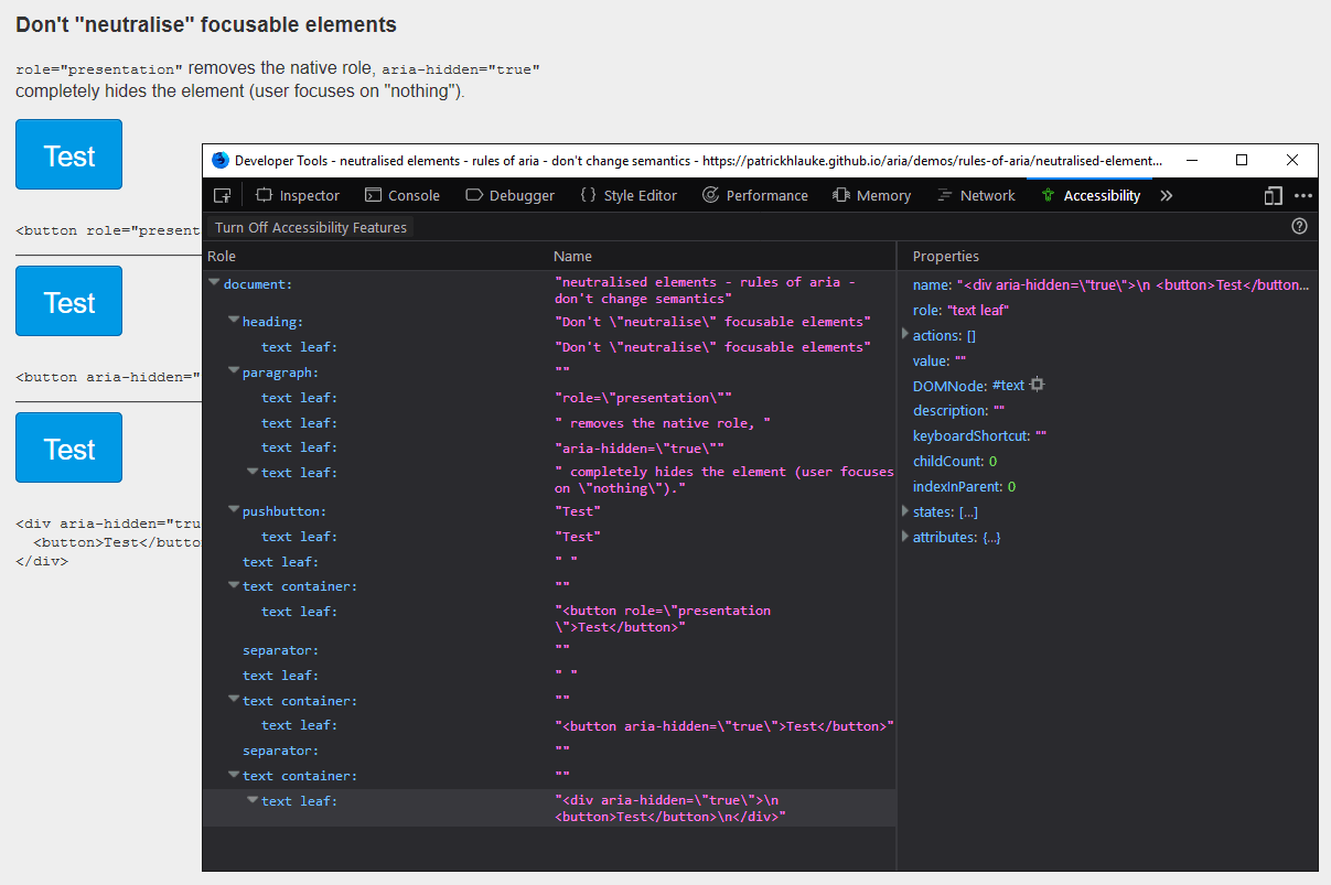
aria-hidden removes nodes from the accessibility tree
(as seen here in Firefox's accessibility inspector)
<!-- don't do this... -->

<span tabindex="0" role="button">
    <span class="glyphicon glyphicon-remove"></span>
</span>
<span tabindex="0" role="button">
    <span class="glyphicon glyphicon-remove">
        <span class="sr-only">Delete</span>
    </span>
</span>

<span tabindex="0" role="button" title="Delete">
    <span class="glyphicon glyphicon-remove"></span>
</span>
<span tabindex="0" role="button" aria-label="Delete">
    <span class="glyphicon glyphicon-remove"></span>
</span>

<span tabindex="0" role="button" aria-labelledby="lby">
    <span class="glyphicon glyphicon-remove"></span>
</span>
...
<span id="lby" class="...">Delete</span>

Chrome DevTools' accessibility panel can help understand which attributes contribute to an element's name
example (Demo) : accessible name calculation
<label for="name" title="Ginny" aria-label="Voldemort"
 aria-labelledby="hname">Harry Potter</label>

<input type="text" id="name">
<span id="hname" hidden>Albus Dumbledore</span>
Demo:: Small Quiz
please do use the native features wherever practical
<label for="fname">Name</label><input type="text" id="fname">
<img alt="Choclate">
<button>Continue</button>
aria-labelledby is one of secondary methods to label native HTML UI elements
Hiding Content Has No Effect on Accessible Name or Description Calculation
 <a href="home.html" aria-labelledby="unseen">
now you don't </a>

 <p id="unseen" hidden>Now you hear me </p>
Accessible name: "Now you hear me"
Self Reference
 <a href="home.html" aria-labelledby="unseen home" id="home">
now you do</a>

 <p id="unseen" hidden>Now you hear me </p>
Accessible name: "Now you hear me, now you do"
Multiple References
<a href="alphabet.html" id="pre"
aria-labelledby="pre a b c">Easy as</a>

accessible name: "Easy as A B C"

<a href="alphabet.html" id="pre"
aria-labelledby="pre c b a">Easy as</a>

accessible name: "Easy as C B A"

<span id="a">A</span>
<span id="b">B</span>
<span id="c">C</span>
Prefer visible labels over hidden labels
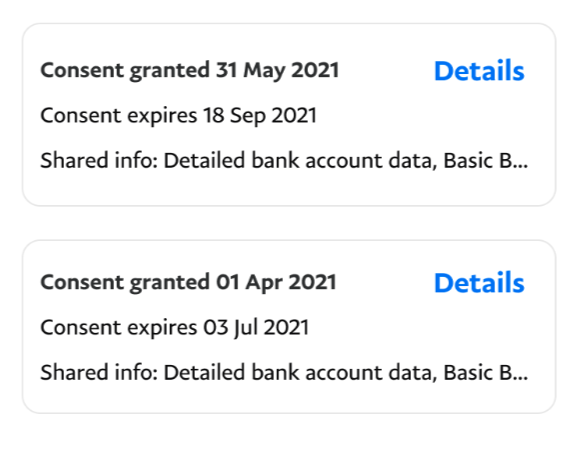
<span id="detail1">consent granted 31 May 2021<span>
<a href="details.html" id="self" aria-labelledBy="self detail1">
	View details
</a>
Above is better than
<span>consent granted 31 May 2021<span>
<a href="details.html"
	aria-label="View details consent granted by 31 May 2021">Details
</a>
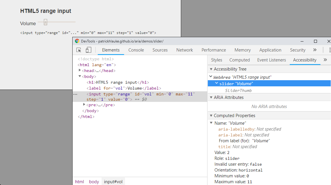
example: HTML5 range input
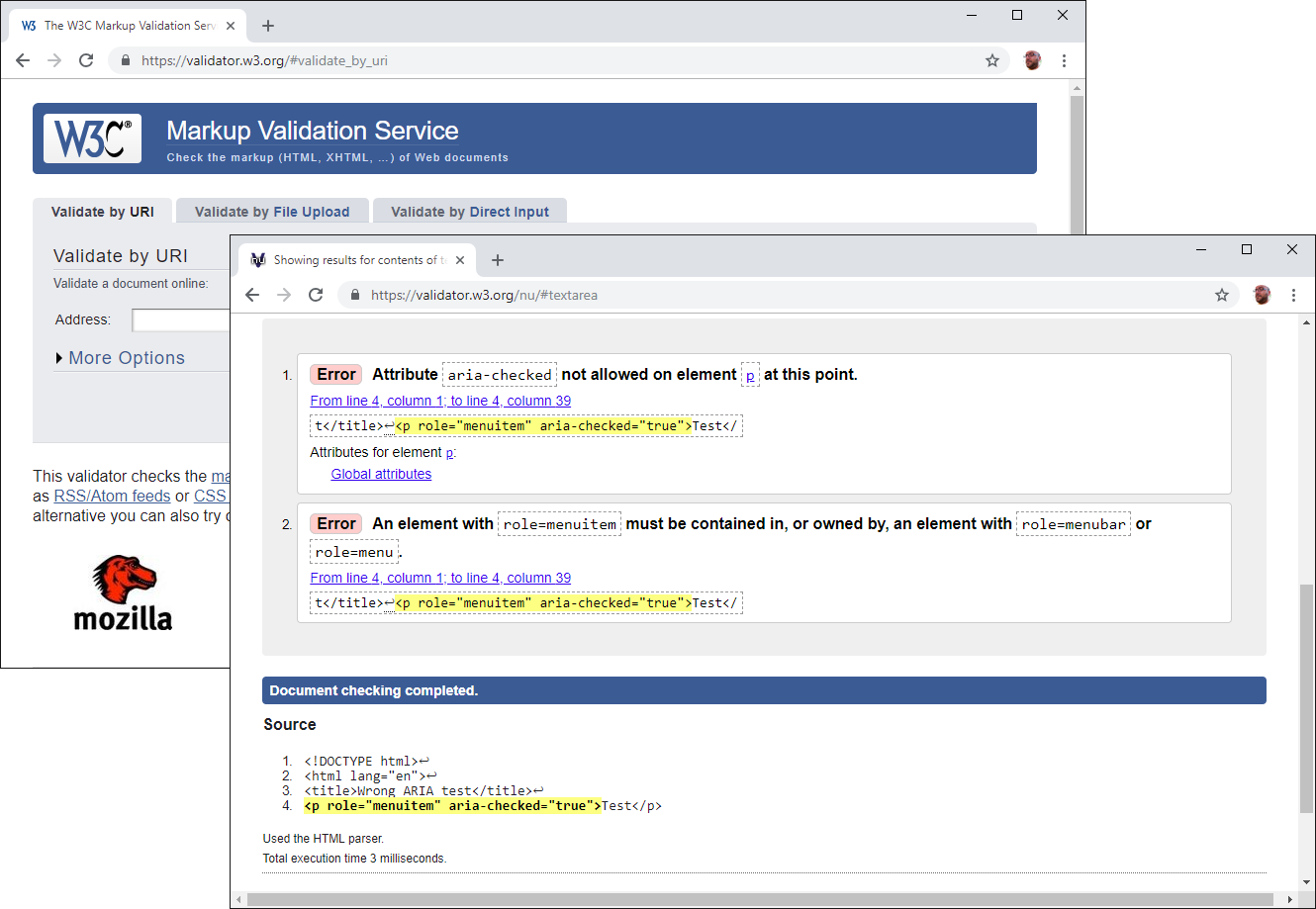
side note: you can validate pages with (static) ARIA validator.w3.org
(not an exhaustive list - enough to understand concepts)
<p class="1" role="heading" aria-level="1">Heading 1</p>
...
<p class="h2" role="heading" aria-level="2">Heading 2</p>
...
<p class="h3" role="heading" aria-level="3">Heading 3</p>
...
example: headings
role="heading"aria-level
<div role="list">
    <div role="listitem">...</div>
    <div role="listitem">...</div>
    <div role="listitem">...</div>
    ...
</div>
example: list/listitem
role="list" and role="listitem"<img> is identified as an image by assistive technologies, and you can provide alternative text.
<img src="..." alt="alternative text">
if your page/app uses inappropriate markup, ARIA can be used to remove semantic meaning. useful for remediation if markup cannot be changed.
<table role="presentation">
    <tr>
        <td>Layout column 1</td>
        <td>Layout column 2</td>
    </tr>
</table>
example: layout table remediation
ARIA 1.1 introduced role="none" as an alias for role="presentation" – they are equivalent (and older browsers/AT likely better off still using role="presentation")
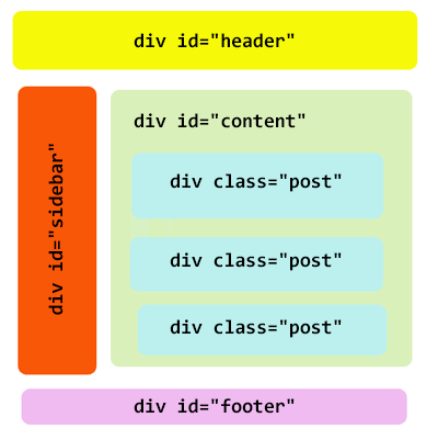
example: blog structure
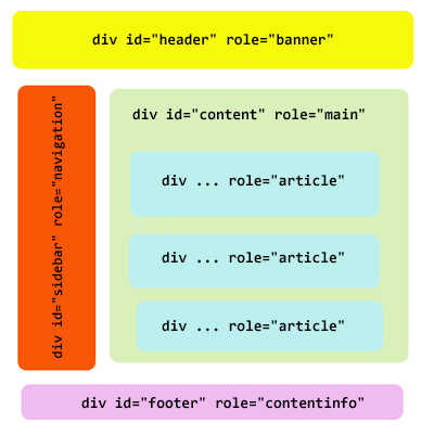
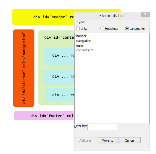
example: blog structure with ARIA
doesn't HTML5 solve this?
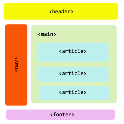
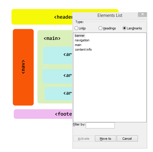
example: blog structure with HTML5
<span class="...">Button?</span>

<div class="...">Button?</div>

<a href="#" class="...">Button?</a>
example: button
while using a link is slightly less evil, as at least it receives keyboard focus by default, it's still not correct: links are meant for navigation, not in-page actions or form submissions
<span tabindex="0" class="..." role="button">Button!</span>

<div tabindex="0" class="..." role="button">Button!</div>

<a href="#" class="..." role="button">Button!</a>
role="button"assuming there's a click handler:
foo.addEventListener('keyup', function(e) {
  // Space key
  if (e.key === " ") {
    // stop default behavior (usually, scrolling)
    e.preventDefault();
    // trigger the existing click behavior
    this.click();
  }
});
you could even do it "in one go" for all your faked buttons, assuming they have the correct role="button", with querySelectorAll and attribute selectors:
var buttons = document.querySelectorAll("[role='button']");
for (var i=0; i<buttons.length; i++) {
  buttons[i].addEventListener('keyup', function(e) {
    if (e.key === " ") {
      e.preventDefault();
      this.click();
    }
  });
}
<input type="checkbox"> hacks – but these may be confusing to AT users/not always appropriate<button>, and extend from therelet's assume we implement this with JavaScript to purely add a CSS classname:
<button class="...">Toggle</button>

<button class="... toggled">Toggle</button>
example: toggle
in real applications, you'll likely keep track of the state in some additional way – this is only for illustrative purposes
<button class="..." aria-pressed="false">Toggle</button>
<button class="... toggled" aria-pressed="true">Toggle</button>
foo.getAttribute("aria-pressed");
foo.setAttribute("aria-pressed", "true");
foo.setAttribute("aria-pressed", "false");
add aria-pressed and dynamically change its value
example: toggle with aria-pressed
getAttribute() / setAttribute()
<button class="... toggled" aria-pressed="true">Toggle</button>button.toggled { ... }
button[aria-pressed="true"] { ... }
if your actual label text changes when toggling, aria-pressed is likely not necessary (could actually be more confusing for user)
<button ...>Mute</button>if (...) {
this.innerHTML = "Mute";
...
} else {
this.innerHTML = "Unmute";
...
}example: toggle with a changing name/label and ARIA versus toggle with a changing name/label only
<span tabindex="0" class="...">Option</span>

<span tabindex="0" class="... checked">Option</span>
example: checkbox
<span tabindex="0" role="checkbox"
      aria-checked="false" class="...">Option</span>

<span tabindex="0" role="checkbox"
      aria-checked="true" class="... checked">Option</span>
role="checkbox"aria-checked and dynamically change its valueexample: checkbox with aria-checked
<span tabindex="0" class="...">Yes</span>
<span tabindex="0" class="... selected">No</span>
<span tabindex="0" class="...">Maybe</span>
example: radio button
<span tabindex="0" role="radio"
      aria-checked="false" class="...">Yes</span>
<span tabindex="0" role="radio"
      aria-checked="true" class="... selected">No</span>
<span tabindex="0" role="radio"
      aria-checked="false" class="...">Maybe</span>
role="radio"aria-checked and dynamically change its valuerole="radiogroup" (cfr. <fieldset>)example: radio button with ARIA (but note incomplete focus handling)
<button ...>More details</button>
<div class="show" ...> ... </div>
example: disclosure widget
<button ... aria-expanded="true"
    aria-controls="disclosure1">More details</button>
<div class="show" ... id="disclosure1"> ... </div>
example: disclosure widget with aria-expanded / aria-controls
<button ... aria-expanded="true"
    aria-controls="accordion1">Item 1</button>
<div class="show" ... id="accordion1"> ... </div>

<button ... aria-expanded="false"
    aria-controls="accordion2">Item 2</button>
<div class="show" ... id="accordion2"> ... </div>

<button ... aria-expanded="false"
    aria-controls="accordion3">Item 3</button>
<div class="show" ... id="accordion3"> ... </div>
example: accordion using disclosure widgets
<button>Launch...</button>
...
<div ... >
    <div>My custom dialog</div>
    ...
</div>
example: modal dialog
...but focus handling is not really correct...
example: modal dialog with focus management
...but for assistive tech users, it's still not clear what is happening...
<button>Launch...</button>
...
<div role="dialog"
     aria-labelledby="modalDialogHeader"
     aria-describedby="modalDialogDescription" ... >
  <div id="modalDialogHeader">My custom dialog</div>
  <div id="modalDialogDescription">
    ...
  </div>
  ...
</div>
example: modal dialog with focus management and ARIA
...almost perfect, but assistive tech users can still navigate out of the modal...
<div id="wrapper">
  <button>Launch...</button>
</div>
...
<div role="dialog" ...> ... </div>
function openModal() {
document.getElementById("wrapper")
.setAttribute("aria-hidden","true"); ...
}
function closeModal() {
document.getElementById("wrapper")
.removeAttribute("aria-hidden"); ...
}example: modal dialog with aria-hidden
note: aria-hidden does not prevent regular keyboard focus!
function openModal() {
 document.getElementById("wrapper").setAttribute("inert","");
 ...
}
function closeModal() {
 document.getElementById("wrapper").removeAttribute("inert");
 ...
}
example: modal dialog with inert
note: inert does hide elements from accessibility tree and remove behavior such as keyboard focusability. however, not natively supported yet – use the inert polyfill
<button>Launch...</button>
...
<div role="dialog" aria-modal="true"
     aria-labelledby="modalDialogHeader"
     aria-describedby="modalDialogDescription" ... >
  <div id="modalDialogHeader">My custom dialog</div>
  <div id="modalDialogDescription">
    ...
  </div>
  ...
</div>
example: modal dialog with aria-modal (new in ARIA 1.1)
...but you still need to do the focus management yourself...
see also: Scott O'Hara: The current state of modal dialog accessibility
there are two approaches for focus:
tabindex: only one element inside widget has tabindex="0", all others tabindex="-1"aria-activedescendant: focus remains on the widget container (or one specific part of the widget), then the aria-activedescendant attribute points to the id of the "active" subcomponentARIA Authoring Practices Guide - Developing a Keyboard Interface
	<span tabindex="-1" role="radio"
		  aria-checked="false" class="...">Yes</span>
	<span tabindex="0" role="radio"
		  aria-checked="true" class="... selected">No</span>
	<span tabindex="-1" role="radio"
		  aria-checked="false" class="...">Maybe</span>
only one radio button inside the group has focus. changing the selection using CURSOR keys, dynamically changes tabindex, aria-checked and sets focus() on the newly selected radio button
example: ARIA Practices 1.2 - Radio Group Using Roving tabindex
not all complex widgets lend themselves to "roving" tabindex – e.g. role="combobox" needs aria-activedescendant, as actual focus must remain inside the textbox.
example: Combobox With List Autocomplete Example
this approach can be complex, and not always supported by assistive technologies (particularly on mobile).
<div id="output"></div>var o = document.getElementById("output");
o.innerHTML = "Surprise!"; // show the notificationexample: notification as result of button press
but how can AT users be made aware of the notification / content change?
one way to notify users of assistive technologies of new content (a new element added to the page, made visible, a change in text) is to move focus() programmatically to it
<div id="output" tabindex="-1"></div>var o = document.getElementById("output");
o.innerHTML = "Surprise!"; // show the notification
o.focus(); // move focus to the notification
but this is not always possible, as it would interrupt the user's current actions...
example: notification via focus() and a more problematic example simulating a long-running function.
aria-live: off (default), polite, assertive<div id="output" aria-live="polite"></div>var o = document.getElementById("output");
o.innerHTML = "Surprise!"; // show the notification
example: notification via aria-live
bonus points: set aria-disabled="true" on the control, and optionally aria-busy="true" on the notification / section of the page that is getting updated. see notification via aria-live, with aria-busy and aria-disabled
roles have implicit live region (e.g. role="status" and role="alert"), as do some markup elements (e.g. <output>)
<span role="status">
    some form of status bar message...
</span>
example: status bar
<span role="alert">
    an alert message (no user interaction)
</span>
example: alert
That works consistently in all browser, AT combos
Modifying the innerHTML of a role="alert" element already in the DOM
errorMsg.innerHTML = "You need to fill in your password.";
Adding a new element with role="alert" to the DOM dynamically
el.insertAdjacentHTML('afterend',
		'<div role="alert">You need to fill in your username</div>');
example: Dynamic alerts
That works consistently in all browser, AT combos
Modifying the innerHTML of a aria-live="assertive" element already in the DOM
errorMsg.innerHTML = "You need to fill in your password.";
Making an invisible ([hidden] attribute) element already in the DOM visible
errorMsg.removeAttribute("hidden");
example: Dynamic aria-live
<div role="tablist" ...>
  <div role="tab" aria-controls="panel1"
       aria-selected="true"...>Tab 1</div>
  <div role="tab" aria-controls="panel2" ...>Tab 2</div>
  <div role="tab" aria-controls="panel3" ...>Tab 2</div>
</div>

<div role="tabpanel" id="panel1">...</div>
<div role="tabpanel" id="panel2" aria-hidden="true">...</div>
<div role="tabpanel" id="panel3" aria-hidden="true">...</div>
example: ARIA Practices 1.1 Tabs with Automatic Activation
variations: Marco Zehe: Advanced ARIA tip #1: Tabs in web apps
not appropriate if you're just marking up a site navigation...
as useful as ARIA is, it is far from perfect...
We have many ARIA attributes that are useful in theory but utter poop because they just don’t work across AT.
Decorative
Use aria-hidden="true"
<button>
<svg xmlns="http://www.w3.org/2000/svg"  aria-hidden="true">
    <path d="M8.982 1.566a1.13 1.13 0 0 0-1.96 0L.165"></path>
  </svg>
<span class="sr-only">Hamburger menu</span>
</button>
Meaningful
Provide title...
<svg aria-labelledBy="docTitle">
 <title id="docTitle">Here is a meaningfull title</title>
 ...
 </svg>
Provide description...
<svg aria-labelledBy="docTitle" aria-describedBy="docDesc">
 <title id="docTitle">Here is a meaningfull title</title>
 <desc id="docDesc"> Additional Description </desc>
 ...
 </svg>
Interactive
Make it focusable with xlink and tabindex="0"...
<a xlink:href="http://paypal.com" tabindex="0">
<rect width="75" height="50" rx="20" ry="20" fill="#90ee90"
stroke="#228b22" stroke-fill="1" />
<text x="35" y="30" font-size="1em" text-anchor="middle"
fill="#000000">PayPal
</text>
</a>
If it is not a link, add a role to ensure it is semantic...
<text y="20" role="heading" aria-level="1">Heading level one</text>
<g aria-label="Startdate" role="slider"
tabIndex="0" focusable="true" aria-orientation="horizontal"
aria-valuemin="Jan 01, 2013" aria-valuemax="Apr 09, 2014"
aria-valuetext="Mar 03, 2013" aria-valuenow="248.46153846153845">
Demo: PayPal AmCharts Plugin